We specialise in making custom spreadsheets, so they differ each time, however there are some concepts and ideas that are used often. We have found that there are currently 8 types of tabs that we generally do. We have also discovered that there are numerous features on each of the tab types, that seem to be popular. On this page, we would like to show you those 8 commonly asked-for tabs, as well as explain what they do and some of the key features. This should not only show you what is possible, but give you some inspiration for your own spreadsheets.
Watch the full video explainer
Watch the short video explainer
- Data Entry Tabs
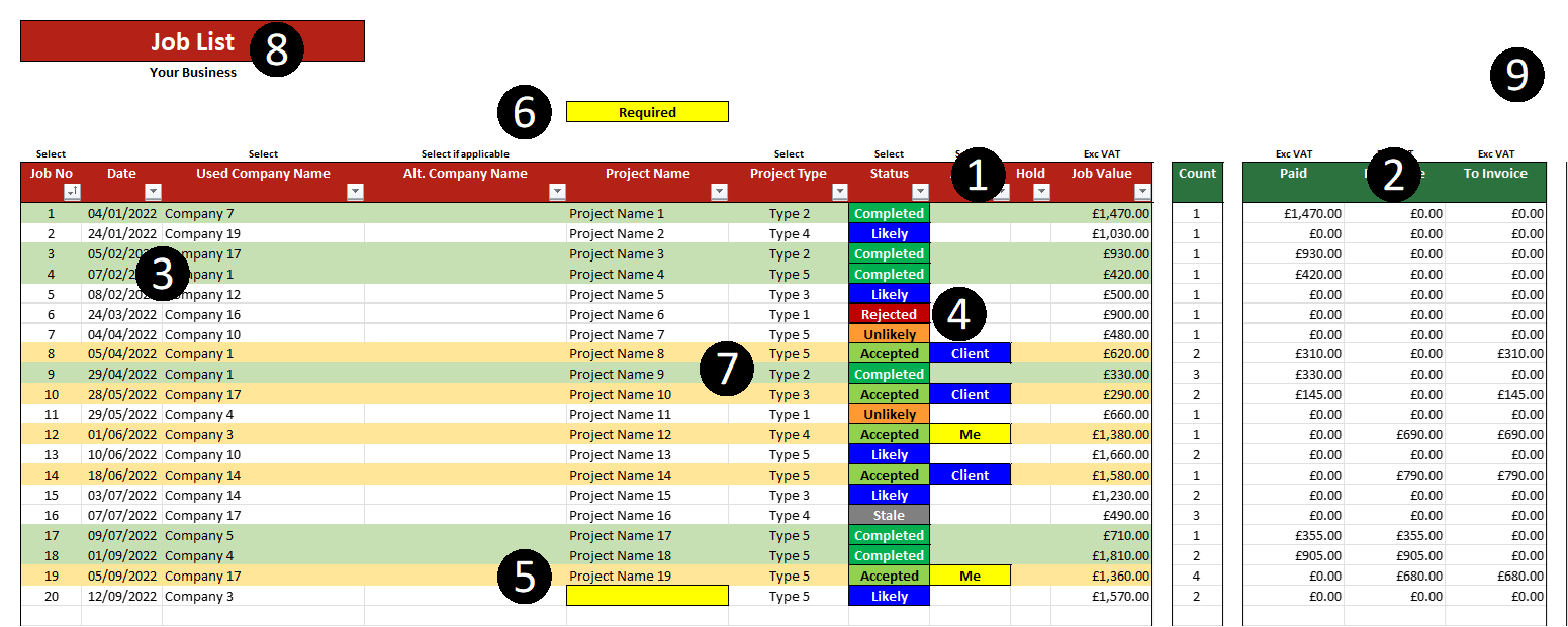
These are the default, classic data entry style tabs. A table-like format with rows and columns, where you can enter lines of data, each relevant to the columns which the respective cells fall under. Most spreadsheets require some form of data to run, so this would be the usual data entry style, especially when the data is being entered manually. See the next type for when you have a CSV file of data which you just wish to dump in the spreadsheet. I would venture a guess that most spreadsheets would have a tab like this in some way, shape or form, so this is a fairly standard tab.
1 – Unlocked data entry cells. We group all the unlocked cells together for data entry, and all the locked and formulated cells together, then we colour co-ordinate each one in a different colour (Usually in your corporate colours). We keep the editable data separate so that you can use the filters to sort the data, but also so that it is clear what data needs to be completed and what is calculated.
2 – Formulated data. The calculated data (relevant to each row) is then set to the side. It is clear that it is separate, so not needed to be completed. As you update the data on the left, this re-calculates, so it is always up to date. This could be totals, alerts, averages, etc. Whatever you need.
3 – Data entry cells. The data entry cells look like blank cells, but there’s a lot going on . Much of this will be addressed in subsequent points, but these cells are formatted for the data. So, they will be formatted as money, dates, times, etc; depending on what needs to be entered. Where possible we use drop down lists, which makes your data cleaner for analysis. These drop down lists can often be edited (see the Settings Tab section).
4 – Colour changing cells. We don’t go overboard with this, but sometimes there is data (entered or calculated) that is important to visualise, and needs to be identified easily. We then have these cells change colour depending on the work or value in the cell. In the case of the example, you would select the status of each job, and who was busy with it, and they would change colour automatically. This makes it easier to spot key elements.
5 – Warnings and alerts. We very seldom see these in other spreadsheets, but they are a staple in ours. When entering data, people often leave out key data which then affects the reporting. Or they type in incorrect data which affects the numbers. For example, entering text where there should be a value, will omit that cell from calculations. We have red alerts for any data that looks incorrect (based on the criteria we set) and yellow alerts for data that is not completed but required. This means that the cells change colour to alert you of mistakes and missing data. This helps to keep your data correct and therefore provides you with more accurate reports.
6 – Alert Headers. We don’t only get the cells to flag up in different colours, but we also get the alert to show at the top of each column. This way if the alert cell is not visible at the time, you can see that there is an alert in that column, in order to set off and look for it.
7 – Row colour changes. When managing different projects, for example, it is often useful to see the whole row in a colour. As a bold colour would get too ‘busy’, we often make the rows change colour in a lighter shade, depending on the status of the row. Sometimes people prefer this, sometimes they prefer just one cell changing colour (like in point 4), and sometimes a combination of the two (if the colours represent different criteria).
8 – Tab headers. We name each tab, and put the header for each, but under the header we also carry over some text. This could be the name of your company, the name of the project, the date, etc. It is usually to show you what you are working on. If, for example, this whole spreadsheet was for one project, then the project name would be there on all tabs. This helps you to see what you are working on.
9 – Behind the scenes. One common ‘mistake’ people make when making spreadsheets, is to show ALL the formulas, even if not relevant. We hide a large chunk of formulas which are doing the heavy lifting. They are off to the right, and hidden away behind locked cells. This means that you are not distracted by loads of irrelevant data, you can focus on what you need to enter, and what you need to see.
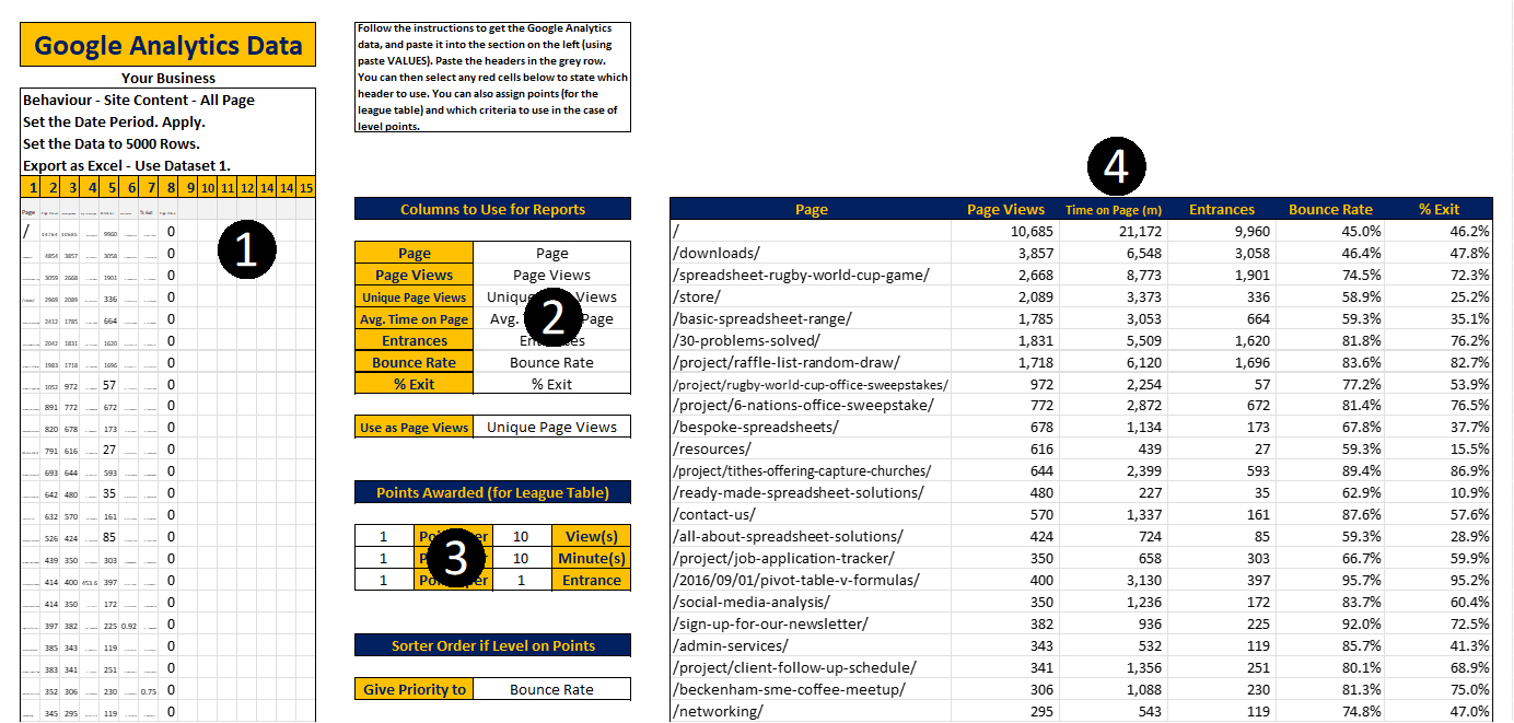
In order to run a spreadsheet, you need data. In some cases you don’t need to enter data manually, as you have a CSV file exported with all the data you need. We often create tabs like this where you can dump the CSV data in, so it can be analysed and reported on. This data entry process is different to the manual entry process, as the layout of the data may change. This needs to have the data dropped in, but needs to be flexible so you can make sure it is all correct.
1 – Data dump. This is a grid of small square cells where you can paste the raw data. You can’t read it here, but that doesn’t matter as the relevant data will become visible later. The extra columns allow for a growing data set, and it doesn’t matter which column the data is in.
2 – The selections. You simply then select which header relates to which set of required data, and the spreadsheet finds it for you. If the headers change names in the future, then these cells turn red, and you simply select the correct header from the drop down list. This allows you to tell the spreadsheet what data to use for what.
3 – Settings. There may be other settings required, like points assigned for certain criteria, or colour changes for certain data, etc. We usually put these on the Settings tab but, in some cases (like CSV data dumps), we often include the settings with the data dump, so that everything can be updated from one tab. This can make things easier, as it is all visible in one place. As we often have the space on such tabs, we may include the settings here. These could also be values for calculations (like the VAT rate, if you wish to add or remove VAT, etc.).
4 – The used data. Once the data has been added, and the settings all adjusted, the spreadsheet will show the data which is then going to be used in the analysis. As the formulas are all done and the graphs are automatic, we want you to be clear on what data is being used, so we show it all here for you. This is based on your selections, so if it is incorrect, you can simply select the correct data. Once you are happy that this is showing the right data, you can then progress to the next tabs, which are usually report tabs on such a spreadsheet.
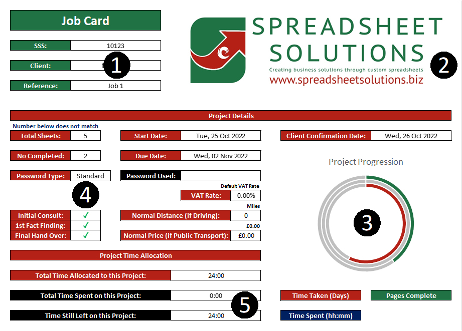
Sometimes a spreadsheet is all for one project. This is often different to entering a whole bunch of data in columns and rows, so we lay this out more like a website contact form, rather than a table of data. We bunch the cells into fields, so that you can progress down the tab, filling in all the required data for that project, which will then be used as and when it is required.
1 – Data entry or selection. These fields could be for manual data entry, or could contain a drop-down list where you simply select the correct data. They could even change colour if the entered data appears incorrect (or is required).
2 – Your logo. This could also be branded for you. Most custom spreadsheets are made in the corporate colours of our client, and their logo could appear on the spreadsheet if desired. If you would like to add any accreditation logos, we could add them too.
3 – Graphs. Just because this is primarily a data entry tab, it doesn’t mean that there can’t be some reporting. As people regularly come back to this tab to update or complete information at a later date, we often include some reporting here, so that it is easily visible. These reports could be duplicated on the Report tab if need be.
4 – Tick Boxes. Technically they are not tick boxes, but actual cells where you happen to be able to select a tick (or a cross). These symbols can then be worked into formulas. For example, if a box is ticked then use this text, or add that value, etc. It is often easier to simply tick a box and have the calculations take place, than having to faff around filling data in somewhere else.
5. Calculated cells. There could be some data that you need to see based on the data you have entered. If so, we show that, but with different coloured headers. So, you can see what you need to see, but you know that you don’t need to fill it in. The data entry cells will be unlocked, and the formulated cells will be locked, so you can’t over-ride them.
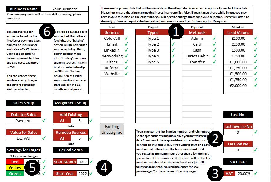
This tab is for any general settings or drop-down list entries. There are always settings that would change from time to time, but which are not necessarily required to be changed for every job or entry, such as the VAT rate, or other settings This often includes drop-down list options that are available for selection on other tabs. Any such settings will be on this tab.
1 – Drop-down list options. These are drop-down list options which will be available for selection on other tabs. Sometimes you need a full data entry tab for such lists, if there is associated data, but sometimes you just need an editable list. We keep those lists here so they are only changed when need be (some clients hide this tab from staff).
2 – Rarely used settings. There are often some ‘starting’ or ‘default’ values required, which you may only enter once or update on rare occasions, but they might be vital for the running of the spreadsheet. Instead of building these in, it’s better if you can adjust them without having to contact us, so we put them here for you to use as required.
3 – Percentage Rates. There may be some percentage rates such as VAT, default mark-up, etc. Any such rates may need to be changed on occasions, but certainly not all the time. Putting them here keeps them out of the way of the regular data entry, but has them accessible, should you need to update them.
4 – Period start dates. Once thing we often do with spreadsheets, is limit them for a period (usually 12 months). Sometimes we set the 12 month period, so you simply use a new template each new year and transfer the required data. Alternatively, we could use a rolling 12 month period where you remove all old data. These methods are put in place to stop spreadsheets from becoming too large and unusable. Either way, we often have the date period setting here.
5 – Traffic light settings. We use the red/amber/green settings on reports and dashboards, but you may wish to adjust what is red, what is amber, and what is green. We will then have those settings here, so you can set what figures fall into each category, which will then determine any colour changes on other tabs.
6 – Spreadsheet name. Often a spreadsheet will be for a specific project, client, period, branch or department. We then either assign this name (in the case of our ready-made spreadsheets) or let you input it, and then this name will appear on all the tabs. That way you know which spreadsheet you have open, regardless of what tab you are viewing.
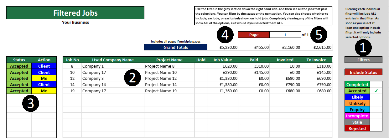
Often you will need to see a filtered list of jobs or entries. If all of this data is manually entered data, you can often just use the filters to filter the data. However, sometimes you wish to see a mixture of manually entered and formulated data, as well as some other alerts and calculations. That is why we often create these tabs, where you can make the selections required to filter the data, and then see the list of relevant entries shown. You could then also keep this filter set, while still showing all the data on the Data Entry tab.
1 – Filters. These are usually off the page to the right, and have drop-down lists and other cells where you can determine what data to include in this list. So, you could select a status, enter a date range, etc, and then only relevant entries would be included in the list.
2 – Filtered list. This would then show the rows of relevant data, based on the filters that were set. These are formulated, so can’t be edited here.
3 – Key information. We often separate key information, purely to make it stand out and be clear for you. This works in the same way as the rest of the data, but will often change colour as per the previous tabs.
4 – Totals. As this is a filtered list, we include the data from the filtered totals (which manually filtering the data doesn’t do). This means that you can see the relevant totals as you apply filters. These can be page totals or overall totals (see point 5).
5. Pages. Very often you could have many rows of filtered data, or very few. So, instead of leaving 1000s of available rows, we very often limit this to 1 page. That way it will show you how many pages of available data there is, so you can simply toggle through page by page. So, if this was showing all outstanding jobs in order of their due date, you may only need to look at the first of (possibly) many pages. You simply select the page number to view, and it will populate accordingly. This gives the flexibility to show loads of data, but the convenience of seeing it in useable groups.
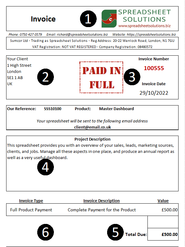
Sometimes a spreadsheet needs to create a document of sorts. So, instead of you opening an old Word template and changing all the figures, you can simply populate a pre-created template here, with the relevant data. This can then be saved as a PDF and used as required. These are often used for things like invoices, delivery notes, progress reports, client summaries, order confirmations, etc.
1 – Branding and document name. This will be printer-friendly so it can be printed or saved as a PDF. We will do our best to make it look like a document with headers, etc. This layout will all be pre-created, with the text changing per selection.
2 – Specific information. This tab could include job-specific information (like client name and address), generic information (like your contact details), and other information (in points 3, 4, and 5). They may all come from different places in the spreadsheet, but they can all come together here, based on your selection.
3 – Selection. In this case you simply select the invoice number, and the rest populates. The date comes from one place, and all the other information could come from other tabs of the spreadsheet. So, for example, the invoice number is assigned to a client, and the client details are on another tab. This could then look them both up, to populate everything in one go.
4 – Calculated text. We occasionally need to do calculated text. So, for example, you may need the text string to be generic but contain specific ‘client-related’ words. Or, you may need one text to show for deposit invoices, and another for final invoices. This can often be automated, within reason.
5 – Totals and values. We can often do calculations at this stage, for example adding VAT. This means that you don’t need to add the VAT calculation for each amount. Simply add it at this stage, and the spreadsheet will check the Settings tab for the current percentage.
6 – Page layout. This whole page is set to be printer-friendly, so you can adjust the page borders. This is usually for 1 page templates, but can be made for more. This means that you can easily save them as a PDF and then move on to the next selection to re-populate the template.
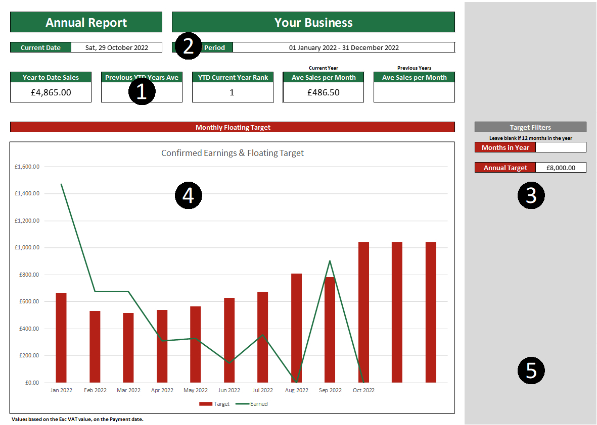
These can often be the whole reason for the spreadsheet: automatic reports that are generated immediately from the data entered. Sometimes fable to filter, but always reliable and robust. These are not to be mistaken for Dashboards, because these often contain reports that do not need to be viewed daily, rather every month, quarter, or year. These reports are often a number of pages long, depending on how much reporting needs to be done. We do advise on what to include in these reports, but we also ask what you would like to see here.
1 – Key figures. These are key, high level figures that you need to know. Sometimes graphs and tables are better, but often you just need to know the bottom line figure and this can show them. These could also change colour according to their value, giving you a useful traffic light system to easily spot how you are doing.
2 – Date ranges. As mentioned before, this spreadsheet may only be for a period of time, and you can usually set that period. This means that we show at what period you are looking, in the report. These reports can get quite large, so we’re clear about what you are seeing, so you can be confident on the results you achieve.
3 – Filters and targets. We often include filters and targets down the side of such reports. This means that you could potentially filter report results, or add targets here. Keeping them next to the report makes it clear as to what has been set or what figures are being used. We keep them separate so that you are clear as to what you need to fill in, as the main report will not be editable.
4 – Graphs. Let’s be honest, most of us love a graph or two. These graphs are built in to the report, but update with the added data. They can combine your entered data, CSV dumped data, settings, and filters applied here, in order to re-populate to your requirements. We often advise as to the best graph to use, but are open to your suggestions.
5. General layout. As mentioned before, this will also be a printer-friendly layout, which you can adjust. So, you can easily print it or save it as a PDF. There will likely be a grey section down the right with filters and selections, which will not appear when saved as a PDF. The rest of the formulas will be hidden off to the right, so you only see what is important to you without all the distractions.
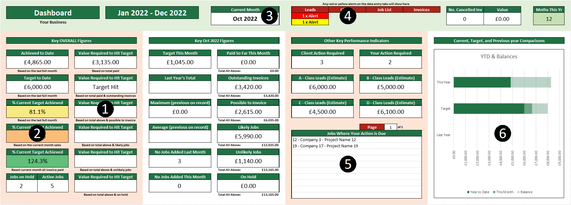
Most people love a dashboard, but tend to confuse them with reports. We separate the Report tab with this one. We believe a dashboard should only contain very high level figures that need to be viewed regularly (like daily), so we use such figures (often from the report) to show them here. This is ideally designed to fit on one screen, so it is all viewable in one place without having to scroll (hence only high level figures).
1 – High level figures. Simple boxes with figures in them. The example may look confusing but, once you’re familiar with what you are looking at, you can simply check the box you need and know what the figure is.
2 – Colour changes. We all love a good traffic light KPI so, wherever possible, we get the cells to change colour, depending on the value shown and your settings. This can be very useful when looking at a dashboard, because you can see straight away if it is good, average, or bad.
3 – Dates. Data could often be relative to a date or period. We show that clearly so you know what you are looking at. These dates can update automatically, based on the current date, so can switch from one month to the next as you start a new month.
4 – Alerts and warnings. We’ve mentioned about warnings for incorrect or missing data. We often like to include these warnings on the dashboard, so you can see straightaway which tabs have missing or incorrect data, in order to address it. There could be other warnings here, too. As you can see, they only show up if they are there, and so immediately catch your eye.
5 – Lists. We can often include short lists, such as top 10 clients, urgent jobs, etc. We can have filters here to filter through pages but, as space is usually at a premium on a dashboard, we only show a few at a time.
6 – Graphs. We usually keep graphs for the report, but sometimes there is a key, high level graph that is required on the dashboard. It’s no problem to include them here, as long as the information is worth the space used.
There you have it, the 8 different tabs we get called to make most often. We hope that this has inspired you to get an idea of what you want your spreadsheet to do, and how you want it to look. When you’re ready to get in touch, we’re ready to make your spreadsheet. If you need something different to what you have seen here, please don’t let that put you off. We are constantly making unique spreadsheets, and some don’t conform to these usual tabs.

