Unleashing the Power of Excel – On your mobile
Excel on your Mobile
Most people don’t even use the Excel app on their mobile. They either don’t want to access work on their mobile, which is fine, but many say that they simply can’t understand what is going on with vast spreadsheets, while using a small screen. So, instead of popping onto their phone on the go or while relaxing, they now need to fire up the laptop to see what they need to.
This got me thinking if we can utilise the Excel app, and make mobile-friendly spreadsheets. I had two major hurdles to overcome.
Can the Excel app handle it?
In the past, the app has been playing catch up, but now it is brilliant. I really was impressed with what it could handle. Many can’t make use of the app fully, as they are reliant on macros, power-query, pivot tables, and other features which either don’t work or don’t work properly in the app. Fortunately for me, my methods for making spreadsheets falls right within the parameters for making spreadsheets for the app! So, if spreadsheets are made like I make them, there are very few issues with the app, all of which I’ve found can be dealt with.
How do mobile-friendly spreadsheets need to differ from desktop spreadsheets?
Space. On the desktop, you usually have a wide screen, and as you know, most spreadsheets consist of various columns all in one worksheet. So, could this be laid out in a mobile-friendly layout? Would this actually work this way? What would need to change? Well, the only way I could answer these questions would be to jump into the deep end and create a spreadsheet to work entirely on the mobile. But what should I make? I decided to make three games. Two of those games are available to download for free, but the third one is the one which I will feature below. I want to show you what elements I’ve included in the games, and how these make spreadsheets more mobile friendly.
Mobile-friendly spreadsheets can either be entirely for the mobile (like these games) or it can be a combination. Some desktop tabs for detailed work, and then mobile-friendly tabs for specific reporting while on the go. There are limitations here, but these are the new mobile-friendly features which I have created and tested in the games, which can now be used in business spreadsheets for mobile viewing.
Mobile-friendly Features
Reduced Data Entry
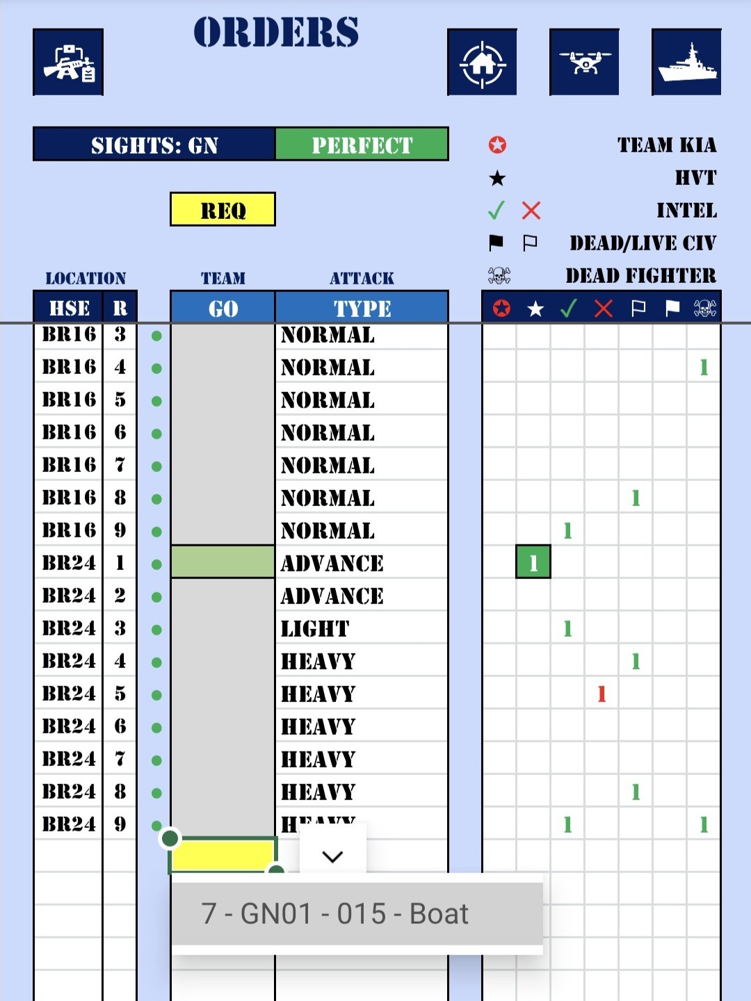
I had to limit the number of data entry columns considerably, especially when holding the phone portrait. A landscape view would allow for more data entry, but scrolling down with a portrait view seemed the most natural, so I went with that.
I tried two different options here one of which allowed me to make various selection on another tab, which then created a code to simply select here. That code then ‘expanded’ behind the scenes to give all the required data. That is why I then ‘hide’ the code behind the colour, as it is not required to be seen and is too wide for the column. All of this providing more data, without wasting space.
The other two options would be to use narrow cells where the text was too narrow to be read, but could still be entered or viewed. Or in fact just to resort to landscape data entry where required.
As usual, the headers are all along the top, and the data scrolls up under that, so you hide old data as you scroll down and only see what you are currently adding. There are some formulated columns (dark blue headers) but they are very narrow (more about that later) and often aren’t required.
Drop-down lists are best on the mobile, as they are easier to select to enter data, but this data can also be typed in if needed, and they all have the usual red and yellow alerts that I often do, in order to show invalid or required text.
Separate Reporting Tabs
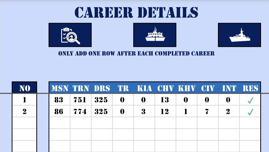
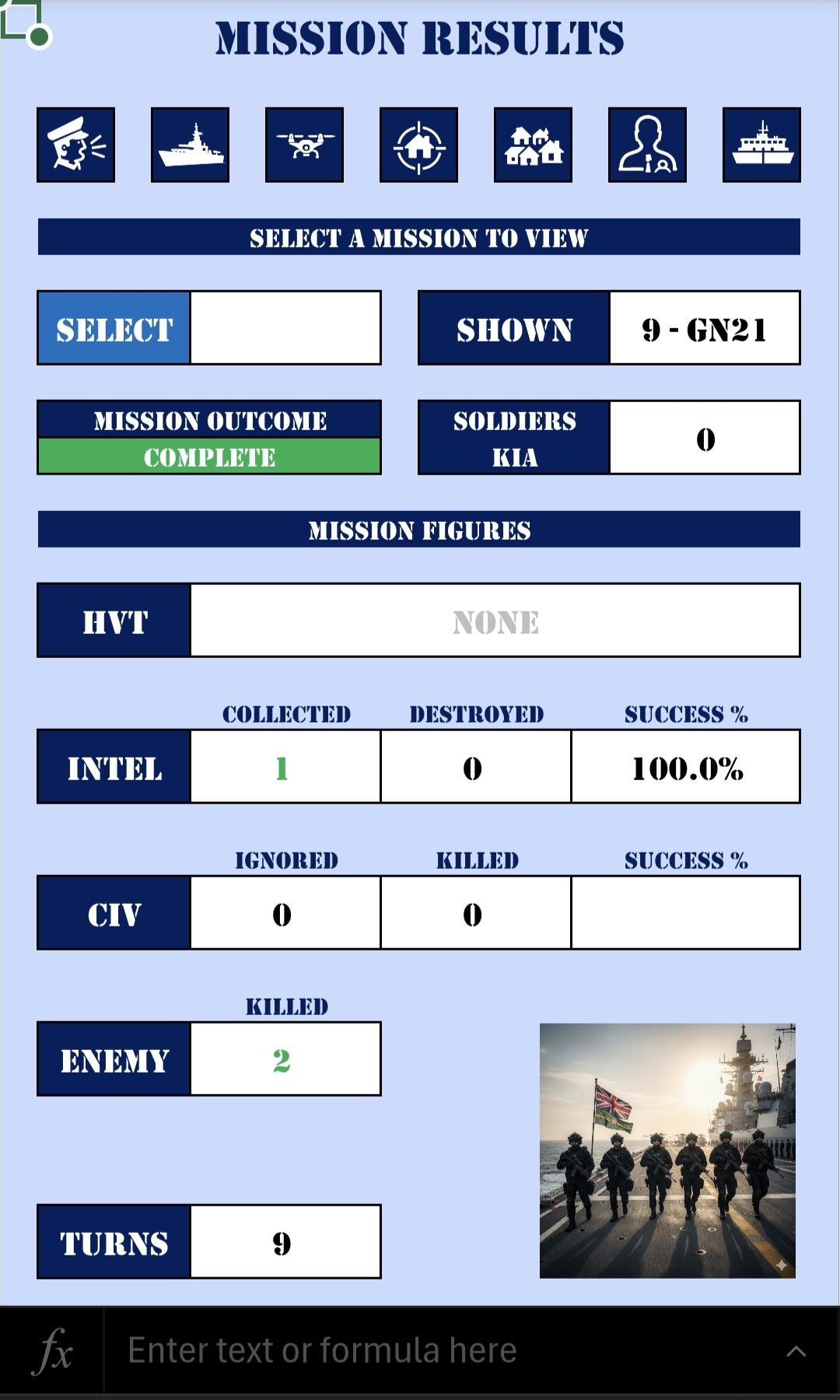
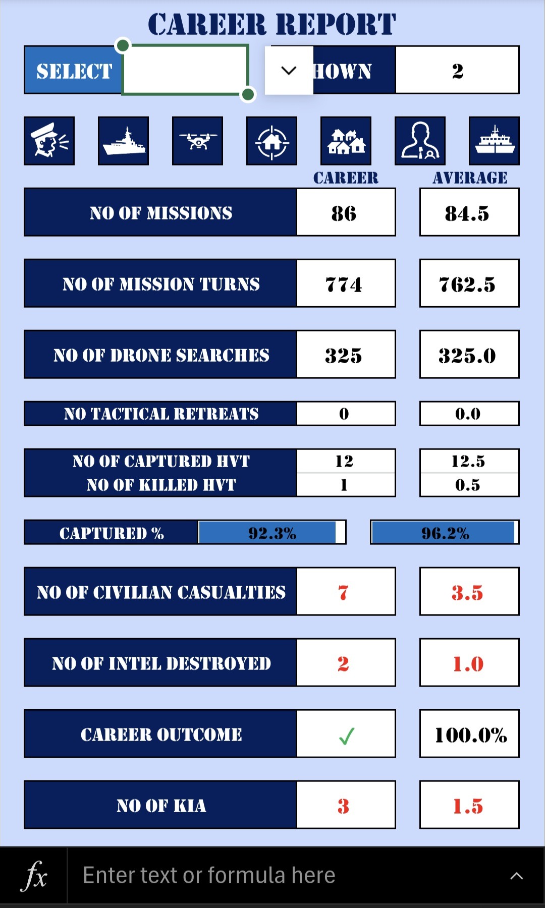
When making a desktop spreadsheet, I often have a number of formulated columns, which show immediate results from the entered data, but there is simply no space on the mobile view, so I have now created a separate tab (page) to show the entered or calculated details from each entry.
In order to save time and effort, the last entry entered, is what shows on the relative report. This means that you don’t need to select which one to view. However, if you do want to view a specific report, you can simply select the one you wish to see. Leaving the selection blank, will show the last entry.
The Mission results example shown, is the results from the entered data on the Orders tab shown above. In fact, in this case it uses multiple rows of data in each report. The Careers Report tab shows one row of data from the Career Details tab.
These reports can be laid out in a screen width format, but with as many rows as required, as you can simply scroll down to see what you need. This is an excellent way of expanding out the data from the data entry, one row at a time. This could be displayed as text, values, graphs, images, or other graphics.
Tab Links
By now you may have seen all the dark blue squares with the white icons on them, and wondering what these are. Well, trying to find a tab on a mobile spreadsheet is a bit of a faff. First to set it to tabs, and then to scroll across to find the right tab. So, I did two things. firstly, gave the tabs shorter names, and then added these buttons to each tab, using up as much space as possible. So, each of these link to other tabs, and they appear where they relate to each other. So, you can simply click those to navigate, rather than having to find the right tab each time. The icon means that I can keep the button small without having to have text, but also have them recognisable.
Clever Use of Graphs
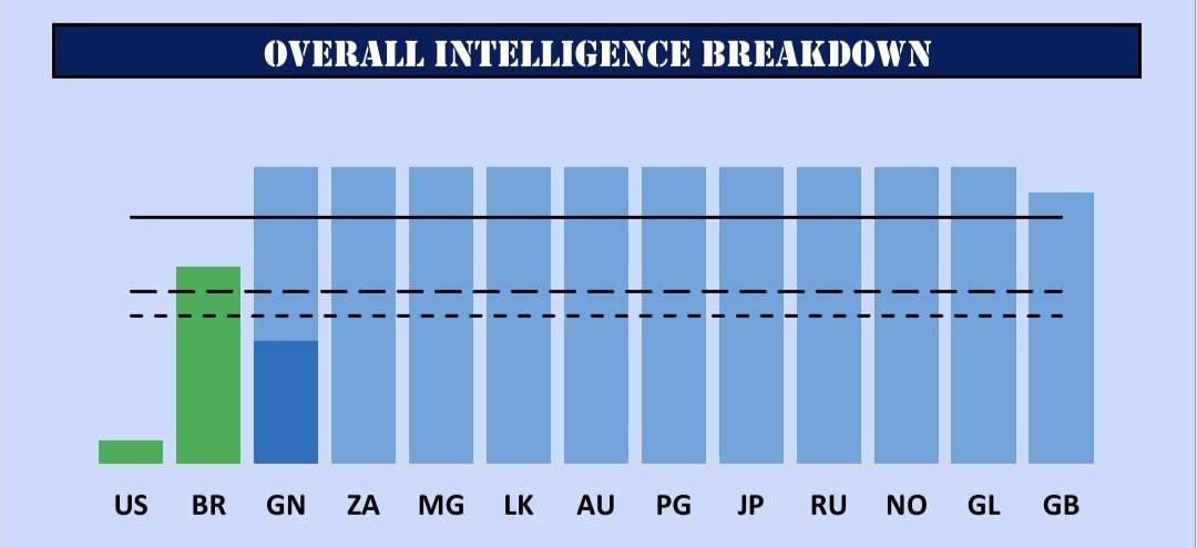
Many people just keep adding graphs to spreadsheets until there are way too many. I prefer to create dynamic graphs, which means that the graph updates with current information, and is based on selections of data rather than static data.
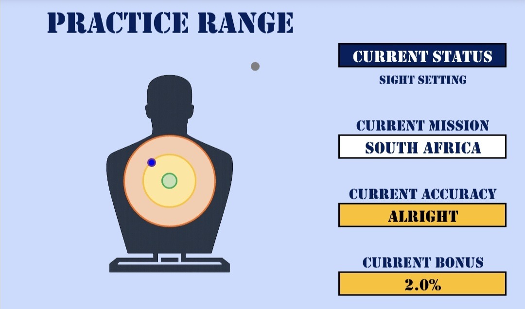
Both this world map and target is using a scatter graph, but the values are carefully plotted to make sense to the activities required.
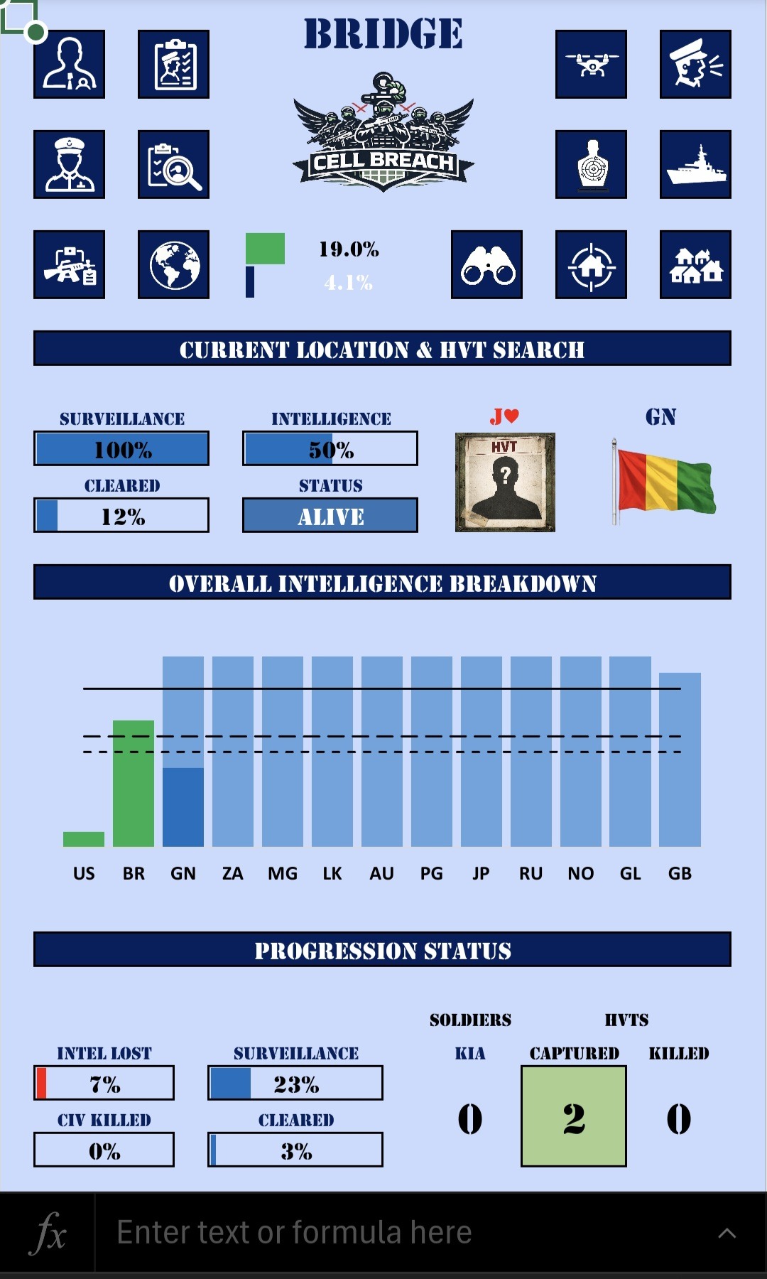
The bar graph in this situation tell us a number of important facts in one graph. Firstly, the colour tells us if we had success or failure (in this case capture or killed the HVT). As the height of the graph and colour don’t necessarily tie up, this lets me see what I have achieved with regards to intel (darker colour segment), how many pieces of intel can still be found (the lighter segment), and the other key thresholds with the dotted lines. And all of this for 13 HVTs as I progress through the game.
Graphs work surprisingly well on the mobile, and I used them far more in the currency trading game. These can show clear pictures on a small screen by using a few tricks. Like, for example, instead of showing 12 or 24 months of data, you could show 6 months at a time, with the option to pick which 6 month period to show. This way we keep the graph manageable, with the flexibility to decide what to show and when.
Created Graphics and Icons
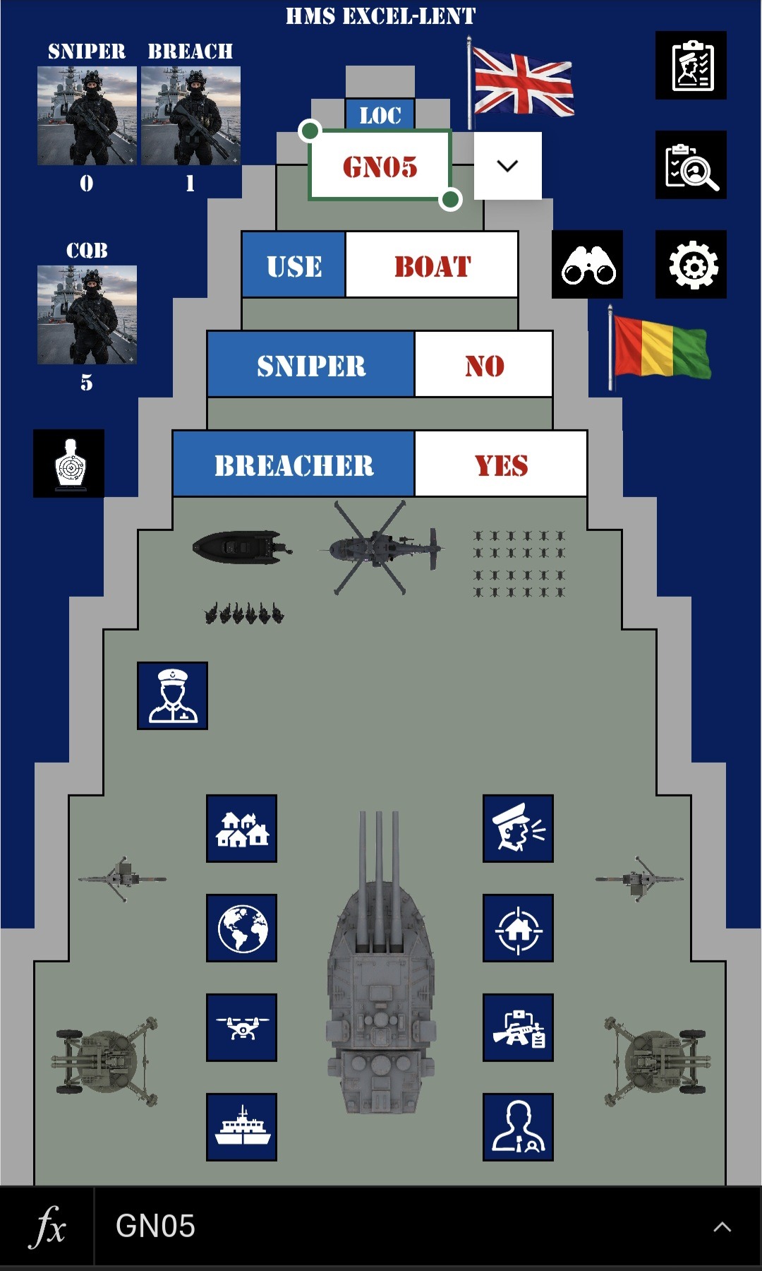
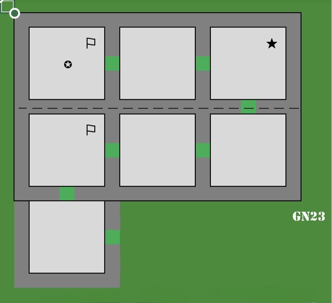
One thing I get to do with games, which may not be useful for business software, is to lay the screen out and create graphics by using the cells.
Now, yes, this might be more useful for games, but think about the potential uses for business. Lay out the stock room floor, lay out the offices, lay out the workflow process, etc. Then I can create the visual representation to tell you the story, with the relevant icons, symbols, and graphics to tell the story.
AI is useful in this regard, as you can use it to make custom images, but all with a theme, and then use them in Excel to tell a story. So, depending on what criteria is met, different images could show.
Imaging a series of conveyor belts, each one representing a stage of your process, and then make-shift ‘boxes’ at each stage, telling the story of how many jobs you have at each stage. Yes, it might not be necessary, but just because it’s a business spreadsheet, it doesn’t mean it needs to be boring!
In this case I have created the deck of a battleship, and the layout of some rooms that get assaulted by the special forces, but this could be anything. Even the images can be used to tell a story. Do you see the little men approaching the boat? If I had selected Chopper above that, they would be approaching the chopper instead. The flags also change based on the location in the game. And once again, we have the various tab links, so that we can navigate around the spreadsheet. I used up all the available space for them in this case, as this tab is central to the game.
Use of Icons & Symbols
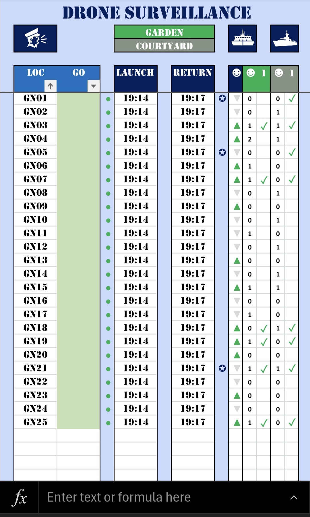
One way I used to reduce space and still show what needed to be shown, was to use icons instead of text. I used it above on the Orders tab, but here is another example on the Drone Surveillance tab. In this case, a list of the available drones are in the drop-down list, you simply select the one you want, and select the current time to send it out. That then produces the respective results (when it returns). Instead of words, it shows graphics instead.
In this case an upward green arrow suggests high signs of life, and the grey downward arrow shows low signs of life. The green and grey sections show how many people in the garden and courtyard, and if it looks like their could be intel available. In a desktop spreadsheet, people tend to use words and have wider columns, but in the case, the icons and symbols can tell a quicker story in a smaller space. Ideal for the mobile. I even use the space between the columns to show which missions have already been run.
Not only does this tell a story, but the icons and symbols can be used in data analysis later on too.
Story Telling & To Do List
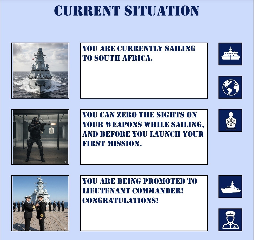
This was an interesting concept I’ve not done before. I could analyse where I was in the game, and then check which actions were usually required at that stage. I was also able to see which of the required actions were already done, and then show the current actions that could be done at any stage.
I then combined those with custom images that I made using AI, and added the relevant links to the correct tab for each action, which then resulted in this very handy ‘interactive to do list’!
Dashboards
Last but not least, we always need a dashboard. In this case it was the Bridge of the battleship, and this showed all sorts of information about the game. in this case the screen is the entire dashboard, but in other games the dashboard scrolls down to reveal more information. This serves as an overview screen which alerts you to issues that need to be addressed on other tabs, and gives you an overview of the spreadsheet.
As usual, I can add all sorts of graphs, images, conditional formatting, totals, and other elements here. And of course, all the tab links so that you can navigate where you need to go from here. In this case even the game logo changes when the game is won or lost, as the space is all used as efficiently as possible.
Some of the mobile-friendly spreadsheets we do are not entirely mobile-friendly, but just have one or two mobile-friendly tabs like this for viewing on the go, while the rest of the spreadsheet is created for the desktop.
Conclusion
So, there you have it, various ways I can make your mobile a spreadsheet-friendly device! Yes, some of this is over the top for a business spreadsheet, but I hope this shows what is possible and gives you ideas about a business spreadsheet for your mobile.
If you need a business spreadsheet created, whether completely, partly, or not at all mobile-friendly, then I’d love to chat to you about making that. Please feel free to get in touch below, or have a look at more information about mobile-friendly spreadsheet, or get your hands on the other two games I mentioned!
Let’s make use of your mobile and the Excel app for your business!


Recent Comments